
Understanding memory computing trend graphs is essential for system administrators and developers aiming to optimize hardware performance. These visual representations reveal patterns in memory usage over time, helping identify bottlenecks, predict failures, and allocate resources efficiently. While the graphs might appear complex at first glance, breaking down their components simplifies interpretation.
Key Elements of Memory Trend Graphs
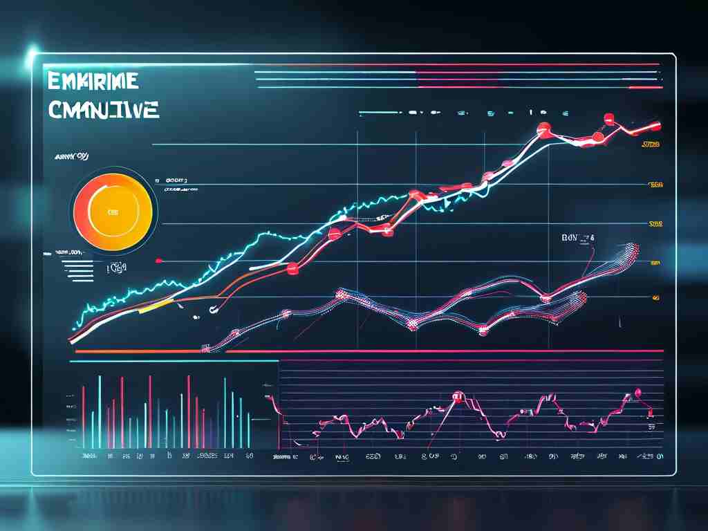
A typical memory trend graph displays three primary metrics: total memory capacity, used memory, and available memory. The x-axis represents time (hours, days, or weeks), while the y-axis shows memory values in gigabytes or percentages. Peaks and valleys in the "used memory" line indicate periods of high or low computational load. For example, a sudden spike might correlate with batch processing tasks, whereas a gradual decline could signal idle periods.
Analyzing Patterns
Long-term trends matter more than isolated fluctuations. A consistently rising "used memory" line suggests increasing resource demands, potentially requiring hardware upgrades. Conversely, frequent dips below 20% available memory might indicate overprovisioning. Cross-referencing these patterns with application logs helps pinpoint causes. If a database query coincides with a memory surge, optimizing that query could resolve performance issues.
Color Coding and Thresholds
Many graphs use color-coded zones to highlight critical thresholds. A red zone (e.g., above 90% usage) warns of potential memory exhaustion, while green indicates safe levels. Administrators should set custom thresholds based on workload requirements. For instance, real-time analytics systems might trigger alerts at 80% usage to maintain buffer space for unexpected loads.
Comparative Analysis
Side-by-side comparisons of multiple servers or time periods uncover hidden inefficiencies. If Server A consistently uses 30% more memory than Server B despite identical configurations, investigate background processes or software discrepancies. Similarly, comparing weekday vs. weekend trends reveals usage patterns tied to business operations.
Tools and Automation
Modern monitoring tools like Grafana or Prometheus automate trend analysis. The following code snippet illustrates a basic PromQL query for tracking memory usage:
100 * (1 - avg by(instance) (node_memory_MemAvailable_bytes) / avg by(instance) (node_memory_MemTotal_bytes)
This calculates memory utilization percentage across servers. Integrating such queries with alerting systems enables proactive maintenance.
Practical Optimization Strategies
- Right-Sizing: Adjust virtual machine allocations based on trend data to avoid underutilization.
- Garbage Collection Tuning: For Java/Python applications, modify collection intervals if graphs show repetitive memory spikes.
- Cache Management: Identify memory-hungry caches using trend correlations and implement size limits.
Common Pitfalls
Avoid misinterpreting short-term spikes as systemic issues. A 5-minute surge during backups is normal, whereas hourly spikes warrant investigation. Additionally, ensure timestamps across correlated systems (applications, databases) are synchronized to maintain graph accuracy.
Future-Proofing with Predictive Analytics
Advanced platforms now apply machine learning to memory trend data. By analyzing historical patterns, these systems forecast future needs—like predicting seasonal demand spikes in e-commerce platforms—allowing preemptive scaling.
In , memory trend graphs transform raw metrics into actionable insights. By mastering their nuances, teams achieve smoother operations, cost savings, and enhanced system reliability. Regular review cycles and tool customization ensure these graphs remain aligned with evolving infrastructure demands.